

Workforce planning starts with a simple question: what can the team do now, and where does it need to improve? A skills radar chart can make the answer easier to scan. It cannot correct an unclear skills model, inconsistent assessment or outdated data, so the visual should support judgement rather than replace it.
What is a skills radar chart
A skills radar chart shows an individual’s or team’s proficiency across a set of skills. Each spoke represents one skill, while the plotted area shows the current level of competency.
This format makes it easy to spot:
- Skills gaps that need attention
- Strengths that are easy to overlook in a spreadsheet
- The balance of skills available when forming a team
Why traditional methods fall short
Most organisations already know that capability gaps exist. The harder problem is locating them precisely enough to make a development or staffing decision. A radar chart makes the underlying skills data easier to scan and compare than a manual spreadsheet or text-heavy report.
Key benefits of using a skills radar chart
1. Clear visualization of competencies
A radar chart gives HR leaders a quick view of where an individual or team is strong and where development is needed. That makes it easier to build a targeted plan without working through rows of numbers first.
2. Better workforce planning
A skills radar chart can support three common workforce-planning tasks:
- Upskilling: identify the skills that need to improve for future work.
- Reskilling: prepare employees for different roles in the organization.
- Succession planning: see whether the organization has people ready to step into leadership roles.
The chart gives upskilling and reskilling discussions a shared view of the capability that exists and the gap a development plan should address.
3. Analyzing employee development plans
Managers can use the chart to shape development plans around an employee’s current competencies and career goals. The plan becomes specific to the person rather than a generic list of courses.
4. Enhancing team formation
A team-level chart also shows how people’s strengths fit together. Managers can use it to:
- Build a broader mix of skills
- Avoid unnecessary skill duplication
- Identify complementary strengths
How to implement skills radar charts in your organization
The chart is useful only when the underlying information stays current. A basic implementation process looks like this:
- Define key skills: Identify the critical competencies for each role.
- Assess current levels: Use performance data, peer reviews and self-assessments to gauge proficiency.
- Visualize and analyze: create radar charts for individuals and teams to spot gaps and strengths.
- Take action: Develop personalized learning paths, promote high-potential employees and fill critical gaps.
What the data can change
The chart does not make the decision, but it can reduce the time needed to understand where attention is required. Its value depends on whether the team can trace each plotted level to an agreed skill definition and a credible assessment.
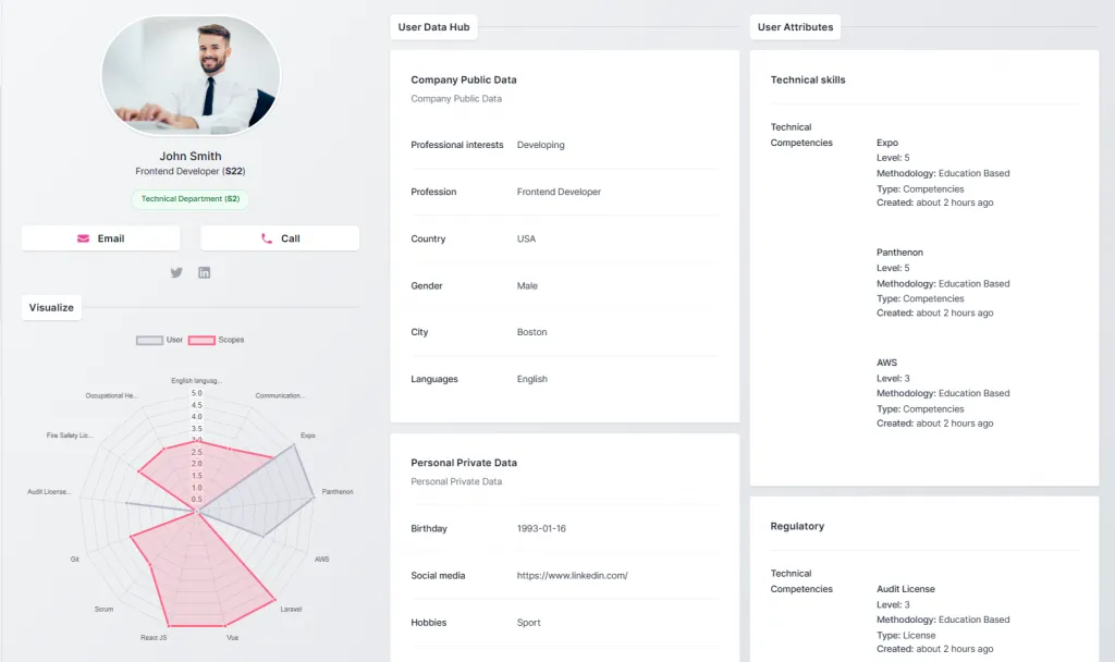
Comparing current and planned skills
Brick, Mortar & Daughter provides tools for visualizing and managing skills data. The system tracks current attributes and skill levels and compares them with planned or desired levels. Managers can then see where the difference is greatest and direct training and development resources toward those areas.